
You just created your first emailing campaign, plan to do so, or have completed and sent out several of your email templates, but nothing is bearing the desired fruit in the form of ROI? Are you wondering what could have gone wrong? Do you want to know what might help you create an emailing strategy that will drive in more leads and clicks? We will be focusing on just that in this article. We will demonstrate mistakes that might cause your email templates to flop. We will share valuable tips to help you improve your overall emailing. And show you the benefits of our Dragit email builder tool! And at the end, we will reward your hard work with a great checklist.
8 Mistakes: YESes and NOs of Email Design
1. UNAPPEALING
NO
- Too much text -> Readers are getting overwhelmed and will not even reach the end, especially the CTA, that you want them to reach.
- Too many design elements -> Readers are flooded by too many stimuli (pictures, logos, colors).
- Dull design elements -> Content of the email template needs to serve a purpose. If elements like pictures fail to do so, they harm the overall design.
YES
- Clear purposeful text -> Just enough text to engage readers but used with a clear aim/purpose. Read it, minimize it, and reread it. Focus on being concise enough but clear enough to be understood.
- Engaging design elements -> Email template is not complete without at least minimal design elements, such as fonts or logos. Use them wisely; they are there to engage and guide—quality over quantity. Less is more.
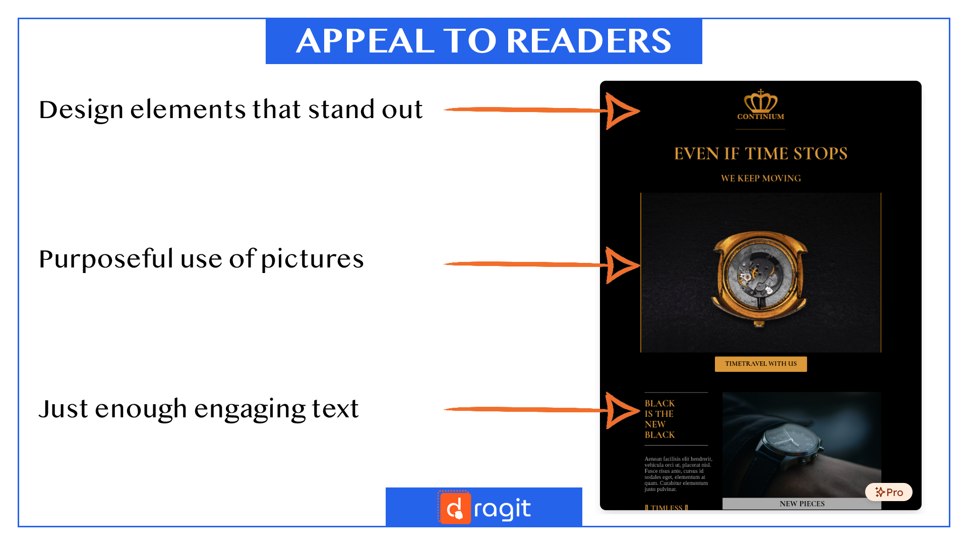
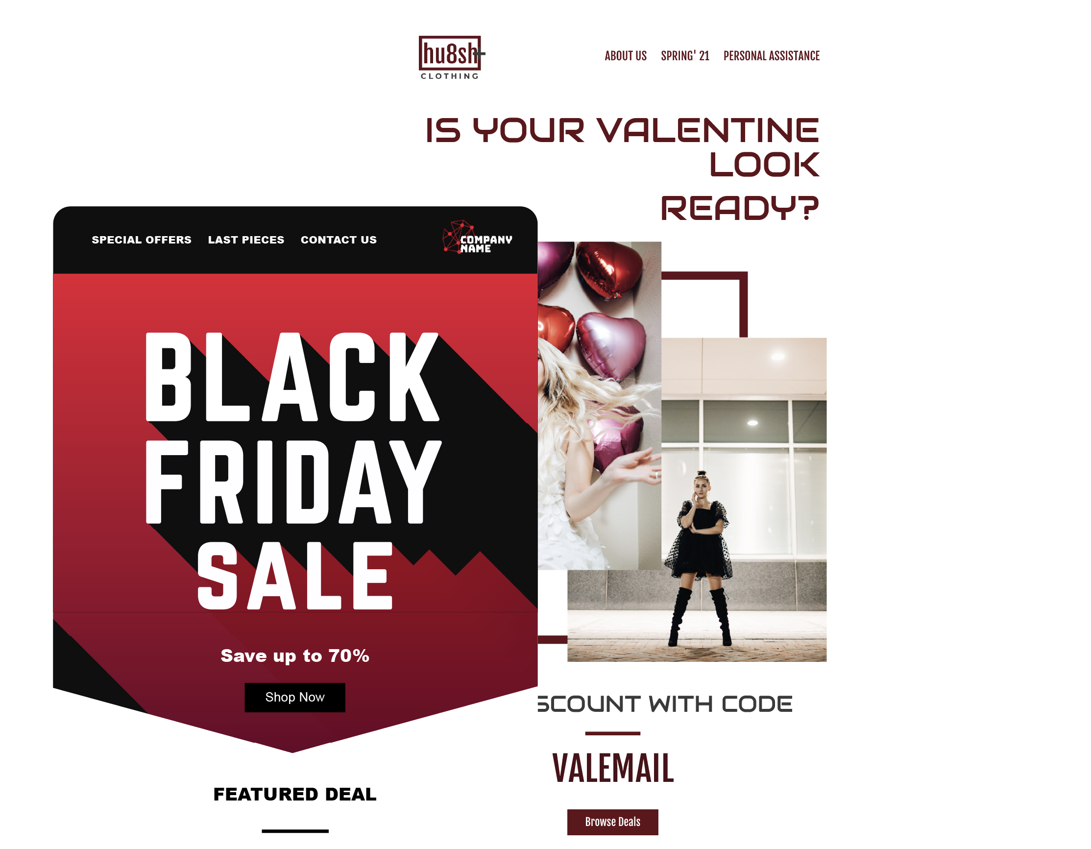
Get PRO Time Stops - PRO Newsletter Template HERE . FREE for Dragit Pro Users.
2. MESSY
NO
- Chaotic -> Readers are lost. They don't know what to look AT or what to look FOR. It may be text or pictures or the overall structure of the email. Don't forget; the chaotic mind says NO.
- Rushed and/or sloppy -> Readers will notice that the email has been done with little time, effort, or both (But you can save time with our Dragit email editor and create email templates in minutes!).
YES
- Organized and guiding -> Your readers can orient themselves in your email. The journey from top to bottom is straightforward; therefore, the email's desired outcome can be achieved appropriately.
- Thought out -> Email template is created with a plan and step-by-step process that builds on top of each other to create a stable, clear structure. Delegate an adequate amount of time and be sure you have done your best.
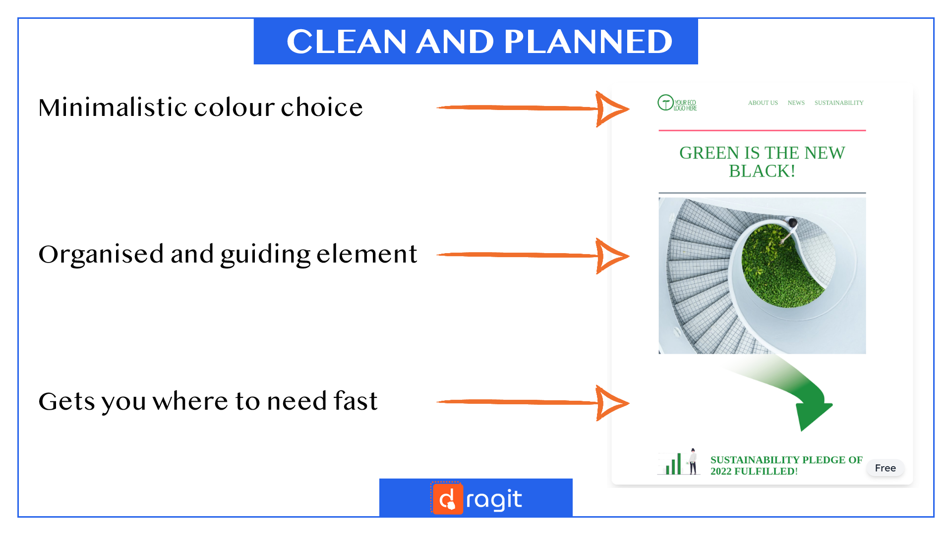
Try Green is the New Black - Free Newsletter Template HERE .
3. PASSIVE
NO
- Unclear goal -> Readers will realize that you did not know your goal while creating your emailing strategy. If you don't see what you want to achieve, you cannot achieve it. You will lose your potential clients as quickly as you lose your goal.
- No/Dull call-to-action -> Readers expect to gain something by reading your email, and you hope to gain something from them. If your call-to-action elements are not clear and not of hight-contrast, clients will never/rarely reach them.
YES
- Purposeful content -> Everything that is put into your email is there to serve a purpose. The purpose can be as minuscule as "being pleasing to the eye" and as significant as "getting the desired purchase." Know what your desired outcome is to get to it.
- Strong call-to-action -> Call-to-action by itself is a strong statement. Use tools, design/content-wise, to make the statement more substantial: contrasting color, bold short straight-to-the-point text, and precise and meaningful location in the email template.
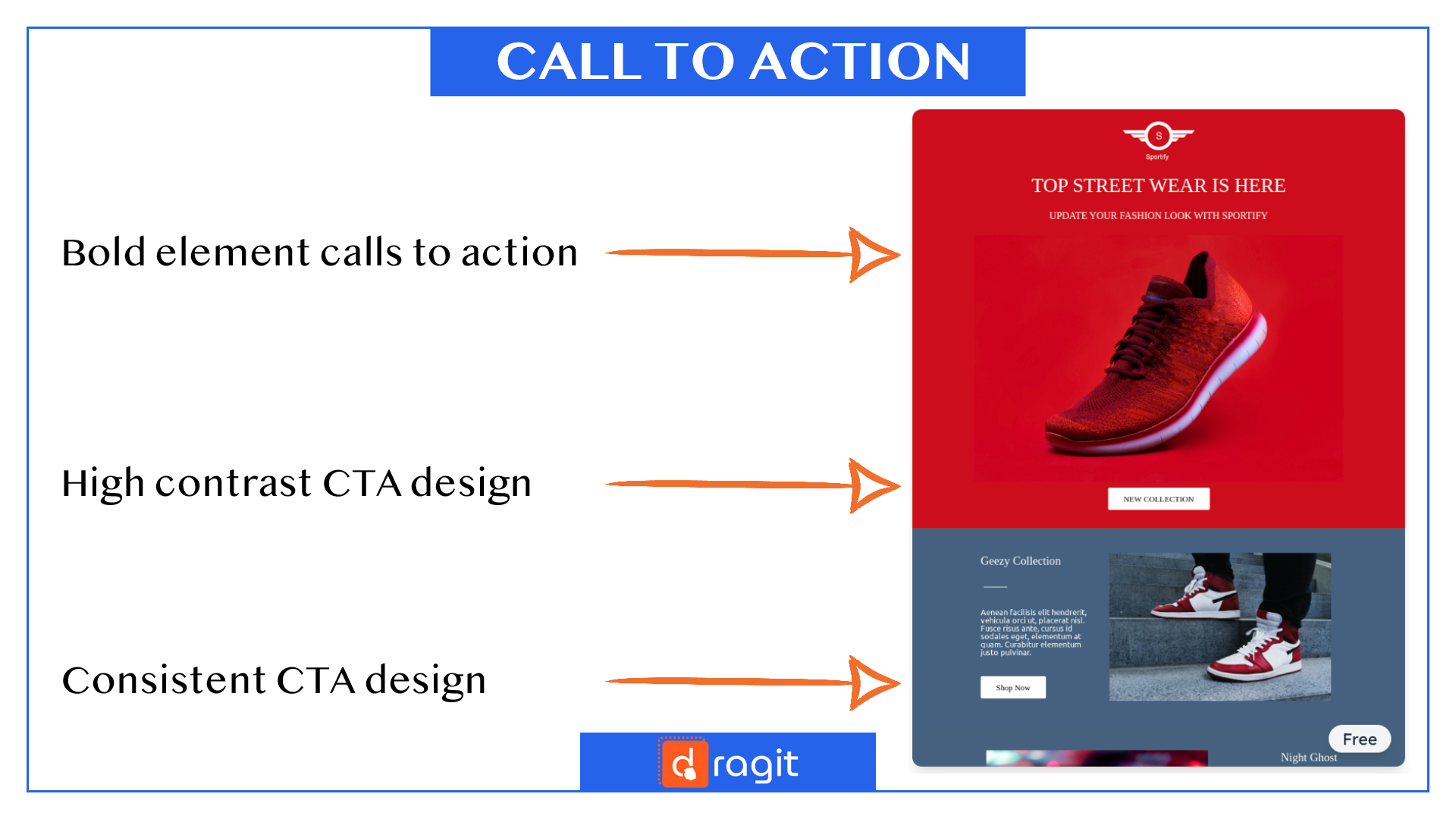
Try Street Wear - Free Email Template HERE .
4. UNRESPONSIVE
NO
- Only PC layout -> Readers are reaching out for their mobile devices, namely their smartphones, the most these days. Focusing only on one static layout of your emails, which is pretty much just for PC, is not a good look.
YES
- Responsive email template-> Focus on creating responsive email templates that will fit most of the widely used devices. Or use an email builder, such as Dragit, where you can quickly and effectively check and adjust to different sizes of screens.
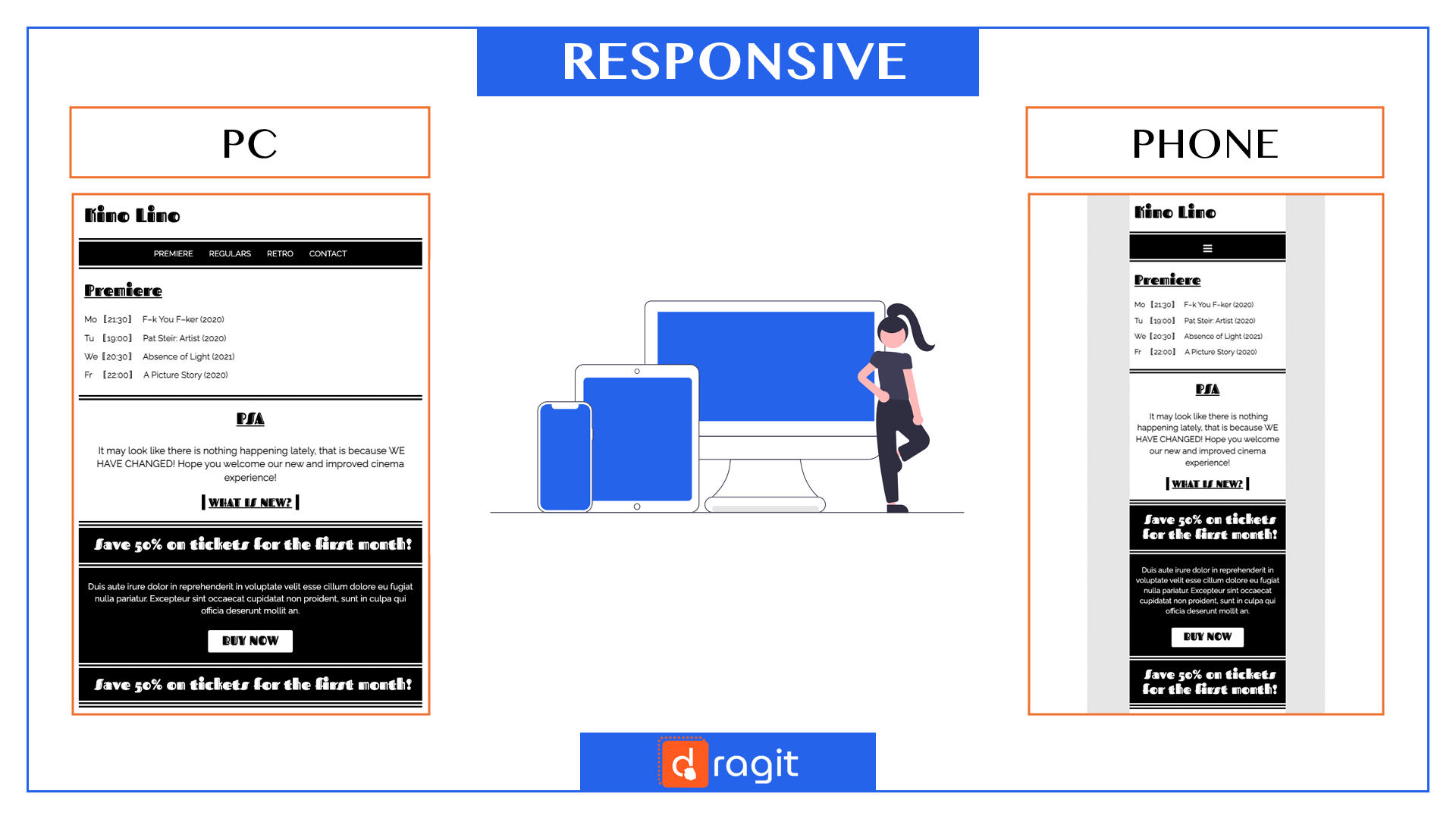
Get This Free Kino Lino Email Template Here
5. UNREADABLE
NO
- Unreadable font -> Readers need to be able to READ your emails. If you use too small, blurry, or over-designed fonts to the point of not being legible, it is time to go back and reconsider your choices.
- Silent or loud fonts -> Readers need to be able to read your emails smoothly. If your fonts and too crazy or too plain, it may deter anyone from reading your emails. The same goes for color. If your colors are too loud or too drab, it may cause your readers to get tired faster.
- Using ununiform fonts -> Readers are used to using their preferred browsers and devices; if your font will not be available or will look completely different there, you might have a severe problem.
YES
- Legible creative fonts -> Finding a balance between being creative and being legible is the key. Balance your font pairings. Simple 2-font-pairing like one sans-serif + one serif font is a good start.
- Contrasting clear fonts -> Use contrasting colors to ensure a sleek appearance and smooth reading. Use different fonts, sizes, and weight to ensure that everything is distinguishable and gets desired attention.
- Uniform fonts -> Use fonts more likely to be uniform over most browsers and devices. Use fonts that you can count on. If you don't know where to start, here at Dragit, we have more than 1000 fonts you can choose from!
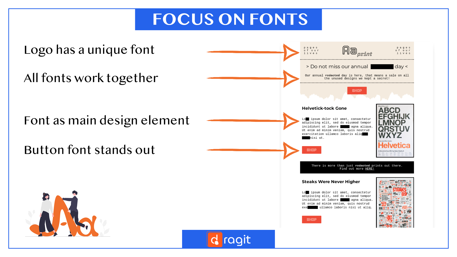
Get PRO Print Newsletter - PRO Newsletter Template HERE . FREE for Dragit Pro Users.
!TIPS AND TRIKS!:It is important to consider what it means to use system fonts vs. web fonts. The system font is usually already available on most devices without downloading. Therefore, it is safer to use to ensure that it looks the same for most readers. Web fonts, on the other hand, are not installed by default. They may be useful for more creative aspects, such as logos, but you should be more careful while using them in your emails (or consider using them as a part of an image instead). Learn more about fonts and how to use them in our article HERE!
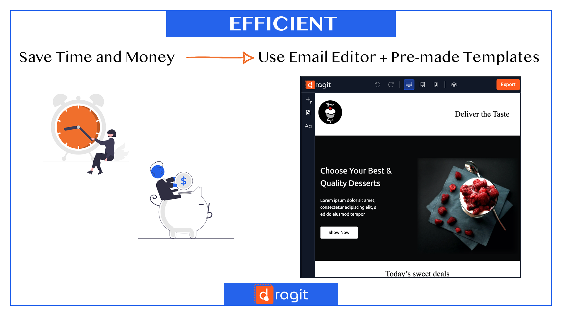
6. EXHAUSTING
NO
- Spending too much time -> Spending too much time designing may sound like you are putting in a lot of effort, leading to the best email. But in reality, it may end up working against you.
- Spending too much money -> When you spend more time, it means more money. Moreover, looking for the perfect design elements and tools may cost you a fortune.
YES
- Efficient -> In designing email templates, like in any other task, it is essential to be the most efficient. Balance your time using online tips, pre-made templates, and other design elements, or create elements you can use throughout your design journey. We have most of that ready for you, so try using Dragit to cut your design time easily in half.
- Worth the price -> Before you start and waste your money, do your research. Try and see what is available for you on the internet for free or literal pennies, and you may be surprised. Spending hundreds of dollars may be a thing of the past. For example, at Dragit, we focus on creating templates with design features (pictures, logos, etc.) that are ready and available for you to use at no extra charge.
7. IMPERSONAL
NO
- Creating too generic emails -> Readers are not a mass flock of identical ideas and preferences. Individuals can differ vastly. Creating very generic emails may lead to you slowly turning to spam for the client.
- No branding in mind -> Readers often tap into their emotions and like to relate and bond with their favorite brands. If you don't focus on your branding, you will be way more likely forgotten.
YES
- Creating more personal and segmented emails-> Focusing on personalization and creating emails that react to how readers interacted with you in the past. Creating emails that address clients by name. Creating emails based on well-done segmentation. To learn more, read about segmentation in our previous article HERE .
- Creating clear and consistent branding -> Branding is who you are as a company. Form your beliefs, language, and attitude to your color palette and fonts. The clearer your image of yourself is, the better you can let it shine in your email templates. To learn more, read about branding in our article HERE.
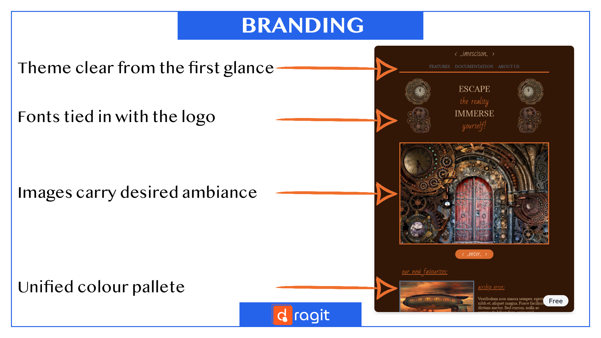
Get This Free Escape Room Email Template Here
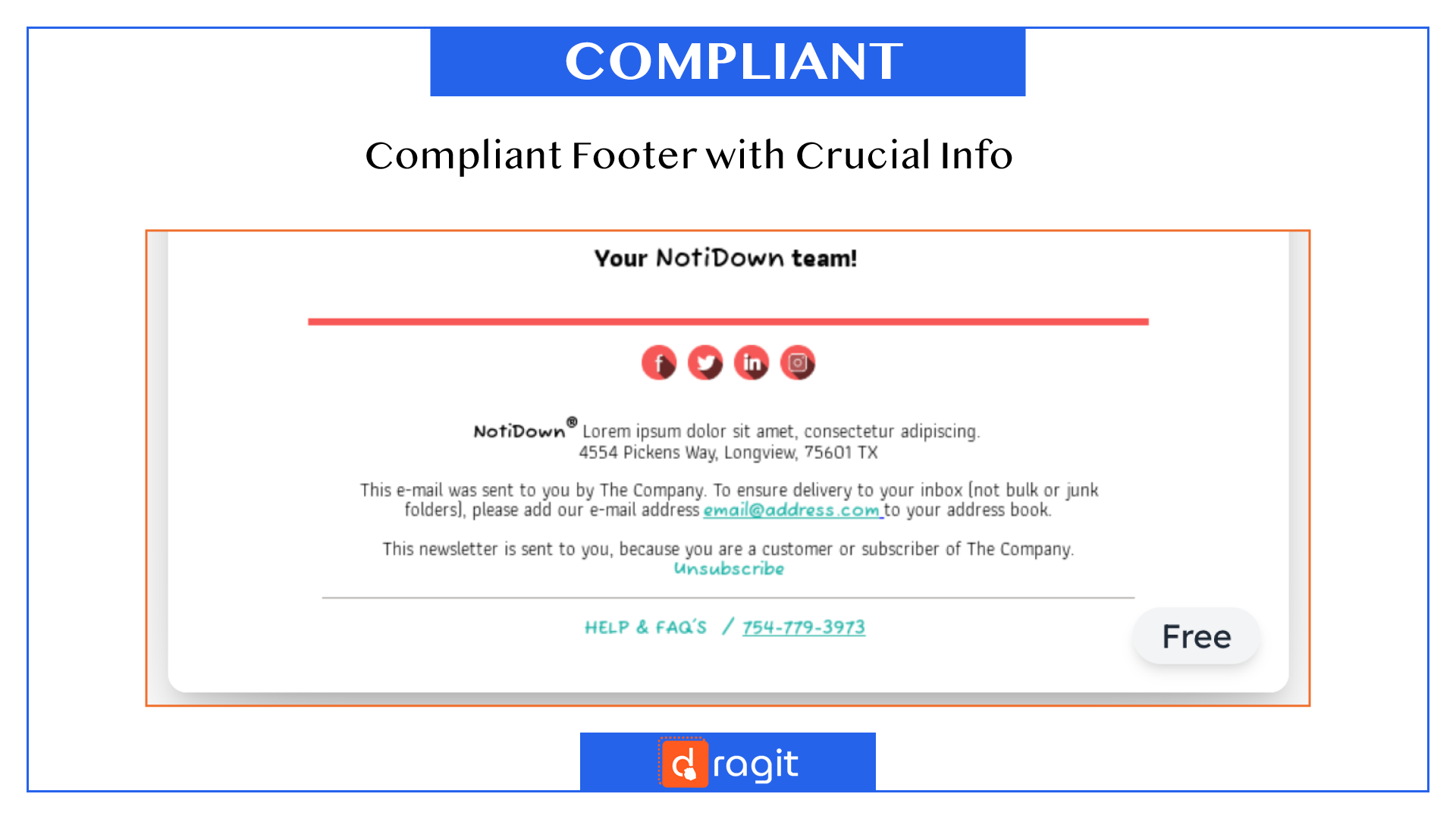
8. NON-COMPLIANT
NO
- Breaking rules that should NOT be broken -> Readers are human beings with rights. In designing, we may speak about rule-breakers in a positive way. But when it comes to certain aspects, creating a healthy, safe environment for our readers MUST be a priority.
YES
- Creating a safe and compliant email -> Focusing on aspects, such as the importance of the "UNSUBSCRIBE" section in your footer. Therefore developing a fair, healthy environment for the reader and legally sound and compliant for your safety.
!TIPS AND TRIKS!: If you are unsure what you need to include, you can use this simple trick. Check out pre-made email templates, they thought of it all for you! Like we did in our free email templates HERE for reference.
Free Checklist: 10 Tips to Help You to Do Email Design Right!
Download Now