
How could your emails be better received by your audience? There may be many aspects you can improve upon that we have covered or will cover in our articles. But one you might have yet to think about is focusing on mobile (or mobile-first) email design. Mobile devices are gradually becoming the most used means to access social media and emails. This means that if you focus on mobile-first template design or responsive designs to cover most mobile devices, you ensure that your emails will come to your audience in the utmost quality. In this article, we will share some basic know-how about mobile design, tips and tricks to use, and give you some real-life examples. As always, all this will be topped with sample Dragit templates. Without further ado, let's dive into it.
Why Mobile Email Design Matters?
We could answer the question just by simple statistics: at least 50% of emails are opened on mobile, and 80% of respondents prefer to use smartphones to read emails (Campaign Monitor, 2019). Simply put, people use their smartphones more to open their emails, so if you focus on something other than mobile-first design, we advise you to focus, at least, on responsive emailing. Even though you may assume that there is no significant difference in designing for mobile devices, that cannot be further from the truth. Not only is the mobile version of your template not “same but smaller,” but not checking how your email template looks on a smartphone-sized screen may be detrimental to your design and, therefore, your desired outcome.
Get to Know the Mobile-First Design
Mobile-first design focuses on designing first for mobile screens. Historically, the PC screen was a basis for email template design, as that was the only and, later on, the most common device to access them. But as we stated earlier, that is not the case anymore. Mobile phones are part of our daily lives and are always at hand for many. We often use them from when we wake up to when we fall asleep. We use them as tools outside of work and inside too.
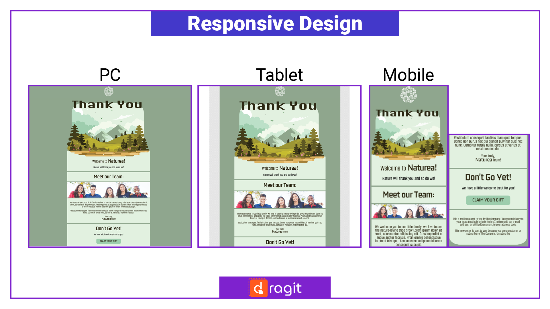
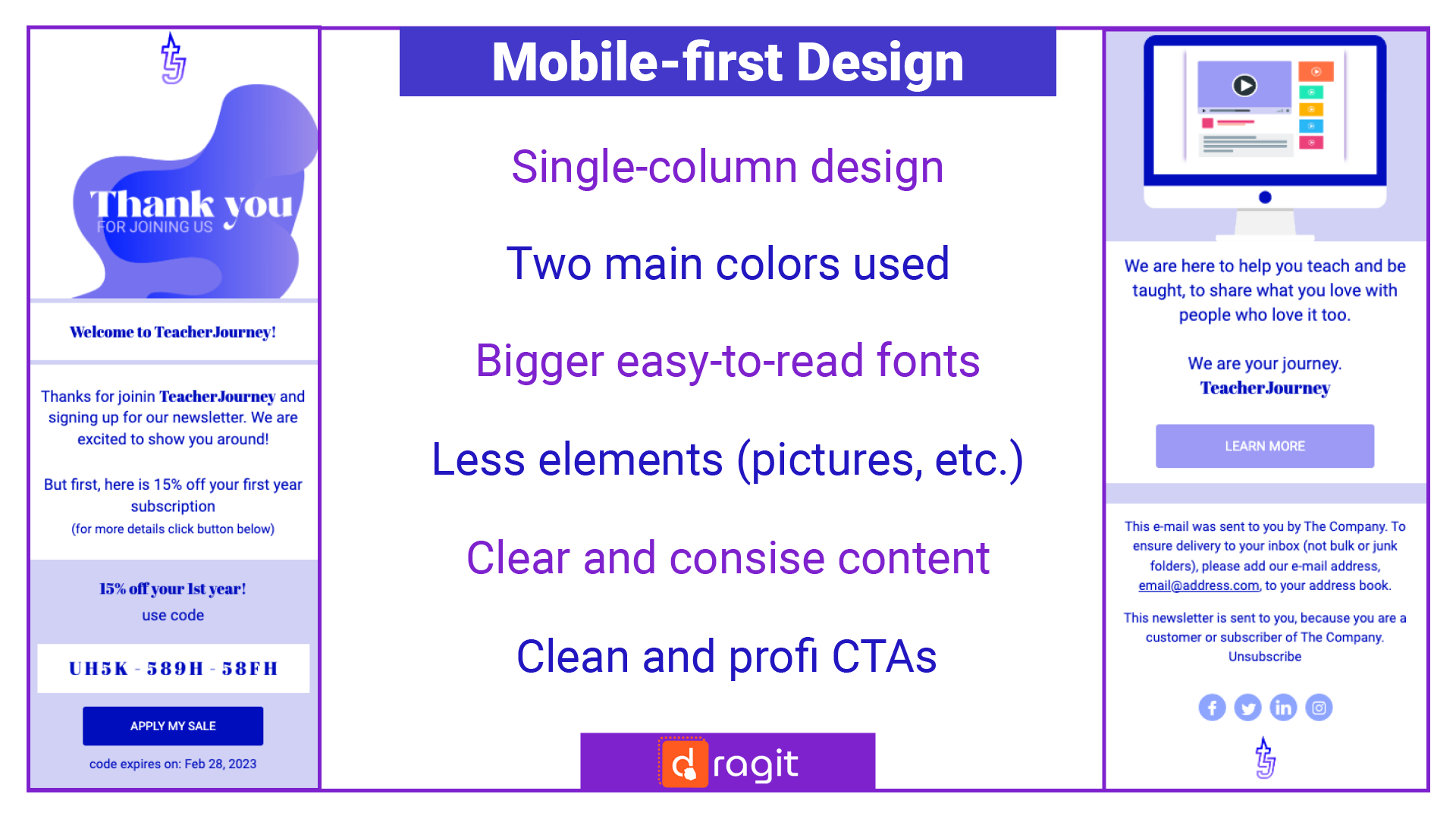
So what is mobile-first design in one sentence? Focusing on the smallest (smartphone) screen first and adding additional items for larger screens later. This approach has some advantages and disadvantages. It may require you to rethink your whole email template design. But you will surely benefit from it, especially if your audience is younger and, therefore, more likely to engage with your content solely on their mobile phones. This article gives examples of our mobile-first template designs sprinkled as visuals throughout.
Mobile Design vs. Responsive Design
Mobile design (or any unresponsive design) is made primarily in a given fixed size for a particular device (or set of similar devices). Responsive design, on the other hand, responds to the size of the device used to view it. Responsive = adapts to a given smartphone, tablet, or PC and will function well and be easily read. It is common nowadays to use responsive design while creating web pages or emails. And we recommend it for email template design, as you can never ensure that your email will be viewed primarily on one particular device.
Top 4 Tips for Successful Mobile Email Content and Design
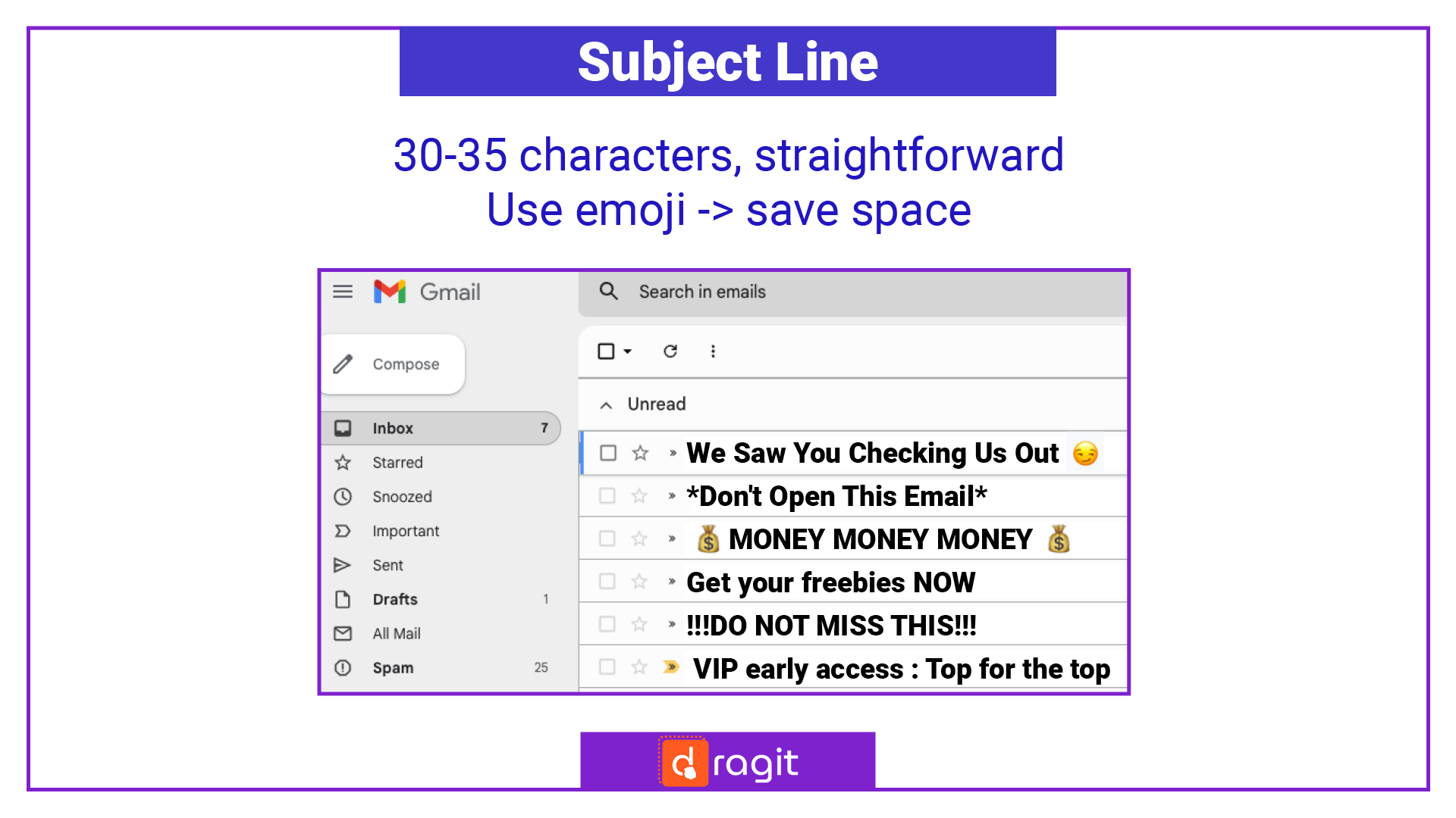
1. Subject Line is Key
Impress your audience at first glance, whether you are designing for mobile or any other devices. Research keywords and sentences that work for your approach and get your audience to make that first desired click. Moreover, remember that on mobile, there may sometimes be even less of your subject line visible, so pump up the most into your first 30-35 characters to ensure your point gets across.
!TIPS AND TRICKS!: Use words that evoke a sense of urgency. Keep it relevant and short, and use some personalized touch, like emojis, to get a lot across with the very little you have.
2. Strength in Structure
If you want your content to be viewed best on mobile phones, ensure that you:
- use fewer columns or design elements that rely on a generous width of the device,
- make the content decently short to prevent scroll fatigue,
- use just the right amount of empty space, so the eyes are not overwhelmed and move smoothly and efficiently throughout.
3. Less is More in Mobile Design
It is always a good idea to minimize your design elements when you are focusing on viewing them on smaller screens, so the best policy is to:
- use the right amount of high quality properly sized responsive images (around 320-385 px for mobile devices); what may seem appropriate on PC may be too busy, too small, or just strange on a mobile phone,
- use somewhere between 1-3 colors in your mobile design; what may look amazingly colorful on large screens may end up too busy on smaller ones,
- use larger fonts in your text; what usually looks very comfortable on a larger screen may seem unreadable on a smartphone - recommend is around 17-22px.
4. CTAs
It is even more crucial to make your CTAs stand out when designing mobile email templates. Not only (as in many other aspects), it is vital to consider accessibility: are people able to read everything and click or access everything you desire them to? But it is also essential to guide your audience well and get them to the desired CTAs. Therefore focus on making everything big and bold enough to be easier to access.
How Email Editors Help
Email editors are often a great help while designing your email templates. They save you a lot of time and provide you with many resources and ideas, and they are incredibly impressive in helping your email be designed with responsivity in mind. Like in Dragit Email Editor, you can view your email or even create it in PC, Tablet, and Mobile view. And you have many free and PRO pre-made responsive email templates you can use in minutes as is or build upon to save valuable time on the less fun parts so you can focus on the details you enjoy the most!
Start Free Trial Now and get all the benefits of Dragit PRO!
Check Out Now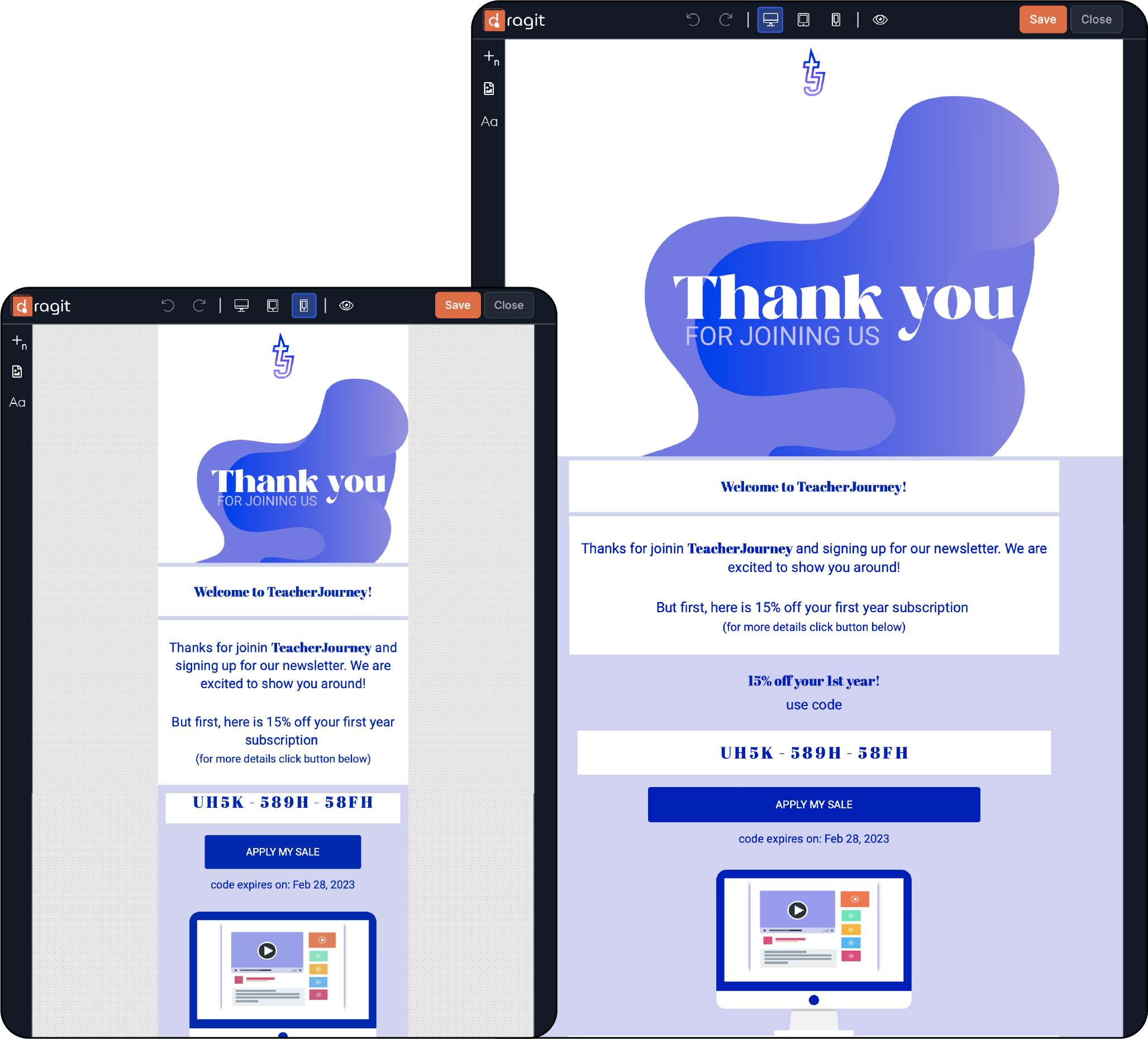
Conclusion
It would have been an understatement to say that it is good to consider mobile screens while designing your email templates. In this day and age, it is almost a must. We recommend you focus on responsive emails above all else, and we do encourage you to at least try mobile-first design to see the difference from the get-go. You have learned that small screens require downsizing, especially regarding the length of your subject line and email content. And they need upscaling, especially regarding the font size and the pictures' quality (and other design elements). So focus on your mobile email responsivity to keep your audience and get the desired clicks.