

Have you created an awesome promotional email but now you are wondering if it is truly converting? Curious about what are the most effective "call-to-action" buttons? Want to get inspired by the email templates and best practices without spending a lot of time browsing the web for them? Then this article is just for you. This article will focus on understanding the "call to action" buttons, their purpose, design, and use in the email templates. Your email marketing (and not only that!) will immediately become significantly more converting and eloquent! Let's start!
What is a Call-to-action?
CTA or Call-to-action is a short written action instruction for a reader. It is created to lead visitors/subscribers/clients to the desired outcome or an event. It is a key element of conversion in marketing. This article will focus on its use when creating e-mails and e-mail templates.
What are the forms of Call-to-action?
While a call-to-action can take many forms, the most common are a text link, a button, and a plain text. In this article, we will deal with the most common call-to-actions forms: buttons.
Call-to-Action Buttons
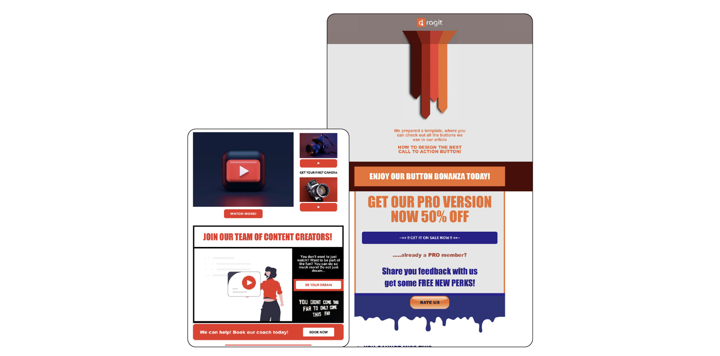
You can create Call-to-action buttons in your email templates for many purposes in the same way, as you will surely have many different goals for the readers. We will introduce you to the TOP 7 goals for Calls-to-action buttons you may be pursuing in your email templates. Additionally, with the help of our FREE Button Bonanza template, we will demonstrate how you may create and use them, all shown in context in the full template here.
Get your FREE CTA Buttons Mock Up (Button Bonanza) HERE.
1.Content Seeking
These call-to-action buttons focus on inviting the client to open a new or continue with the already outlined content. For example, you may use such buttons as "READ MORE" and "CONTINUE WATCHING THE VIDEO". This way, you may convert your customers to visit your website ( consequently increasing your traffic) or go to your social media.

2.Result
These call-to-action buttons are targeting the result that action will bring. They are not only converting your leads to potential customers but also showing them the key goal/benefit you will get to them. E.g. "I WANT A CHANGE", "START NOW", or "RESULTS ARE AT YOUR FINGERTIPS!".

3.Event Calls
These call-to-action buttons encourage clients to participate in a given event/activity. They may be used by the company working directly in event management to convert their attendees to reserve their spots, or even any company conducting a present or a virtual event, such as a meet-up or a webinar. What you may write on such buttons are: “BOOK YOUR TICKETS”, “COUNT ON ME”, “HOLD MY SEAT”.

4.Services Reservations
These call-to-action buttons help motivate clients to use your services. With the help of these buttons, you may convert your readers to book a slot with you or a consultation. E.g. BOOK AN APPOINTMENT.

5.Sales
These call-to-action buttons focus purely on making a quick leap straight to a sale. They are used by e-commerce businesses to convert leads to customers fast. On them, you may want to write “BUY NOW”, "USE COUPON”, “ORDER NOW".

6.Sharing
These Call-to-action buttons are mainly designed for social media sharing and following. Examples of such buttons include: "FOLLOW US”, “SHARE”, “LIKE US".

7.Review seeking
These call-to-action buttons are used to ask for feedback from the client. Examples of such buttons could be: “HOW SATISFIED WERE YOU?”, "LEAVE A REVIEW”, “COMPLETE THE QUESTIONNAIRE”.

!TIPS AND TRIKS!: Don't forget that while many popular and standard ways of creating call-to-action buttons exist, the way you choose your design depends only on you and your creativity has no limits, same as your imagination! So don't hesitate to use your branding to look unique. The more creative they are, the more will your buttons become unmissable and irresistible!
You can even create a "Play" icon out of the button:

How to design CTA buttons?
TIP 1: Lean on branding. So what is "branding"? Your company's brand is a cumulative image and an ambiance of everything, from your product, logo, and color palette to communication and choice of language and employees. It is essential to keep your branding in mind when creating CTA Buttons.
You will reflect it in your content ( i.e. distinctive language, text on the buttons etc.), in your design, meaning what colors and styles to use (i.e. contrasting but harmonious, do you prefer curved or sharp lines, etc.) and in your brand psychology, aka which emotion would you like to evoke (i.e. energetic and modern company, or a long history and solid foundation).
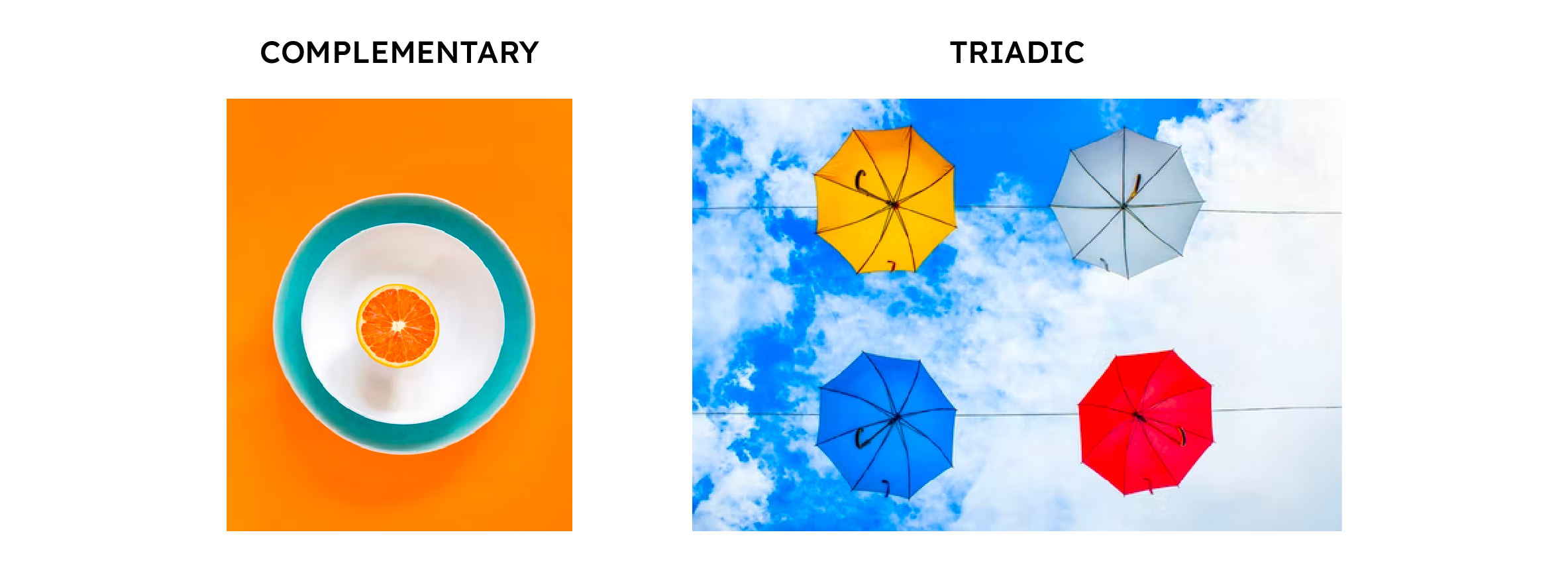
!TIPS AND TRICKS!: We will talk more about color theory below or in our other articles, but in the case of using branding when creating CTA buttons, it is important to focus on a) the emotions and personality of your company, b) colors that contrast but at the same time they fit your brand! It is ideal to use colors:
2: Don't be afraid to get inspired. Thanks to today's internet age, there's no need to look far for inspiration in any area of your email design. Take a look at individual call-to-action buttons and email templates on any search engine, or check out our collection of FREE email templates at Dragit!
!TIPS AND TRICKS!: Inspiration is a double-edged sword; remember, it's good to be inspired in the process of creating something of your own. But if you want to be unique, you shall stop at just inspiration. Otherwise, you can completely lose your identity in the flood of others' ideas!
Create your own converting email templates with Dragit!
Sign up for free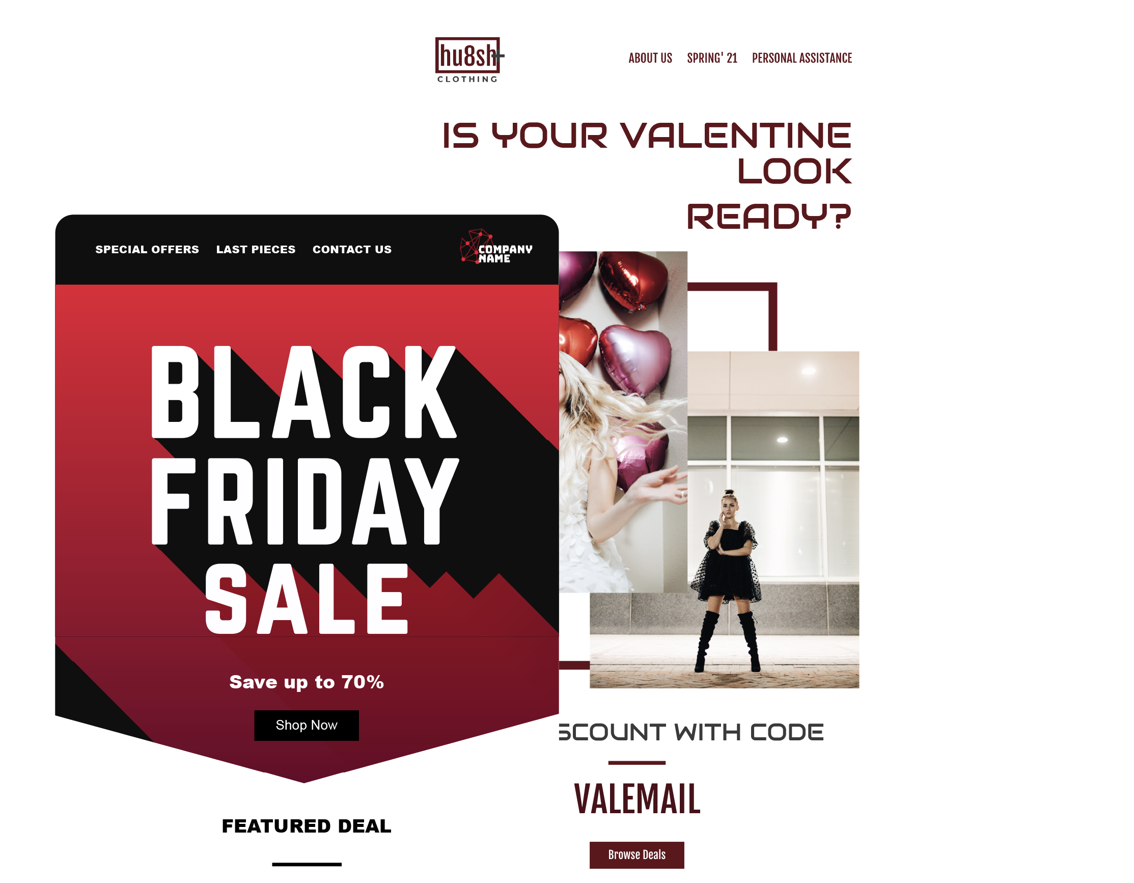
TIP 3: Get to the point. When designing your e-mail, it is possible to go a little crazier with the content; when creating CTA buttons. It is best to capture as much as possible by writing as little as possible. One clear word, one distinctly colored button with bold, legible text, and the surrounding context that clarifies everything and is able to lead the client to the button, and you've won! Less is more!
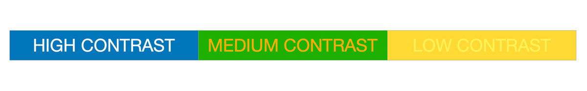
TIP 4: Be visible. Keep in mind your primary CTA and help yourself by bringing attention to it as clearly and smoothly as possible. Use contrasting colors and bold, easy-to-read text. Buttons need to almost jump off the screen onto the client, so you'll do best with the most contrasting buttons possible, such as red on a white background.
TIP 5: Measure twice, cut once. Don't forget to test your buttons. Not only their responsiveness on PC, tablet, or mobile (which our email editor Dragit makes incredibly easy for you) but also their use and perception by clients. That way, it is easier for you to create email templates with such button styles, that work for you!
!TIPS AND TRICKS!: You can, for example, try to do a mini-research with your subscribers that will advise you which is the better option for you, as e.g., HubSpot did in their test of red vs. green VKA buttons!
TIP 6: Consistency is the key to success. As we will mention below, the emotions certain buttons evoke in us are very important to keep in mind when designing CTA buttons. As part of your branding, this emotion is something you want to keep in your clients, so it's best to be consistent. Therefore, do not forget that whatever button you design for a given purpose will become a "flagship" for the given action. Consequently, it is better to spend more time and care creating the buttons at the beginning, so it helps you to stay consistent. Clients will appreciate it, and it will make your conversion easier.
!TIPS AND TRICKS!: For a company with primary colors blue, black, or white, use orange color for the most urgent CTA button (BUY NOW!); for a less urgent need for the action (SIGN UP FOR SUBSCRIPTION), use a less prominent/contrasting color, such as another complementary slightly contrasting blue or purple.
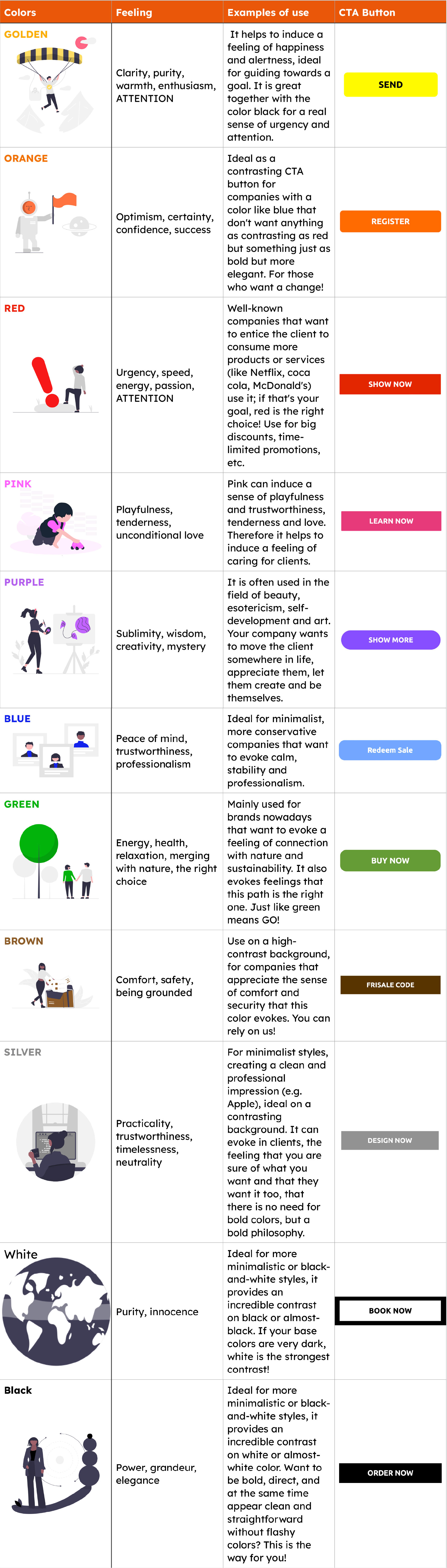
How psychology of color can help you?
For most of us, colors are one of the core aspects of our perception of the world; we also attribute to them, or use them to describe, many of our emotions and experiences. It is no coincidence, that even when designing e-mail templates, and CTA buttons in them, you need to think more deeply about colors. We will soon prepare a more detailed article for you just about colors, but in this case, it is mainly necessary to remember what feelings colors evoke in us and how you can use them.
What are the take aways?
We learned that CTA buttons help us push our clients/subscribers to the given action. When designing them, it is necessary to be minimalistic but daring in their content and unmistakable but complementary in their design. Knowing who you are, what you are trying to convey to clients, and what action you are trying to encourage them to take is essential. It is also important to remember that you need to remain yourself but not be afraid to get inspired.