
A font is the first thing, your readers will see while opening your email. Not only, it is, most often than not, part of your logo. Sometimes, it may be the only thing they see, as some email clients block images form first-time senders by default. Great thing is, there are many tips and tricks related to fonts. They are not only used in e-mails as plain text but they can also become an integral part of your design! This Article sums up our best tips and tricks for your email templates design. You will learn to distinguish font properties, see best and worst fonts and you will be able to use your branding and our font-related tips to create the best email templates. You can try them out right away on our specially designed email templates. Let's start!
What is font?
So to start off, font is a set of characters, that can be either printed or displayed on a screen. Those characters usually have a particular size, colour and design. A text without those characteristics is usually called a typeface. So you can think of a font as a subtype to typeface.
“Helvetica is a typeface – a complete set of sans serif characters with a common design ethos. However, it is made up of a whole collection of fonts, each in a specific weight, style and size…” -creativebloq.com
Font and typeface are often used interchangeably even tho they are different, so do not be surprised! According to Adobe Fonts, there are around 20 thousand different typefaces they offer. When we look up some other famous sources of fonts like myfonts.com, there may be over 130 thousand fonts floating around the internet for you to use! That may be overwhelming to say the least. We will slowly break it apart for you, pick the best ones you can use and give you some basics to build on!
5 Tips for Best Usage of Fonts
Know Font Properties
There are several font properties you may set up. We will mention most of them throughout this article. This section introduces you to all the essential properties and what you need to know about them.
a) Font colour
When it comes to colour in your email templates, you can usually choose one colour for your text and one colour for your background. Of course when you are creating logos or special promo materials outside of email template editors, like Dragit, you can be even more creative in the colouring of your fonts, but this should be more than enough for you needs (remember there is a fine line between being different and being too much). Depending on what you are using to design your e-mail templates, colours can most often be chosen by their HEX code, by colour palette, by the “eyedropper” colour picker or by the amount(%) of R(red)G(green)B(blue).
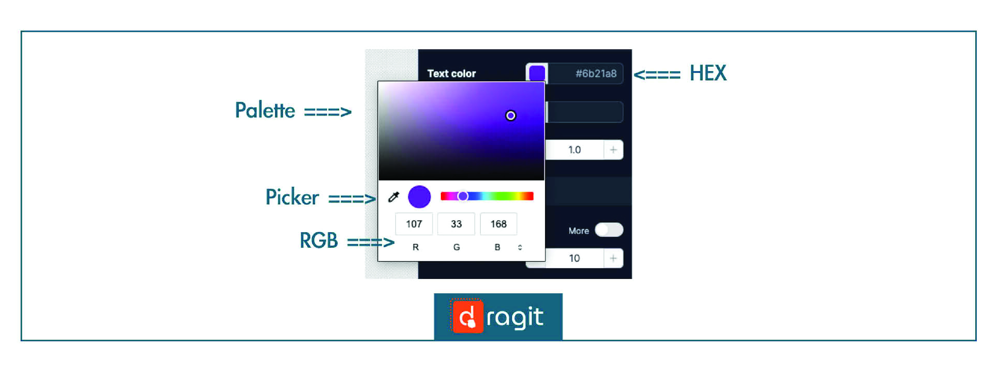
All the options are available in Dragit Email Builder and you can learn how to use them using our FREE Wedding Email template HERE.
b) Font Size
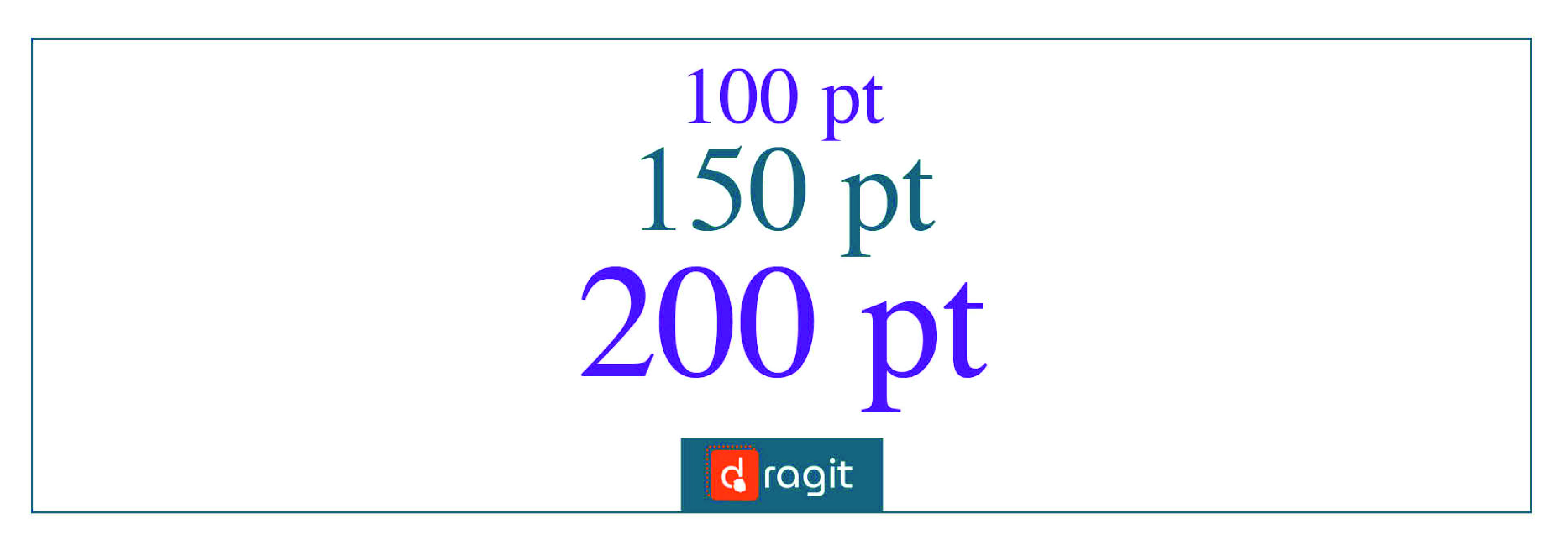
Font size determines how big your text will be and is usually shown in pixels (px) or points (pt).
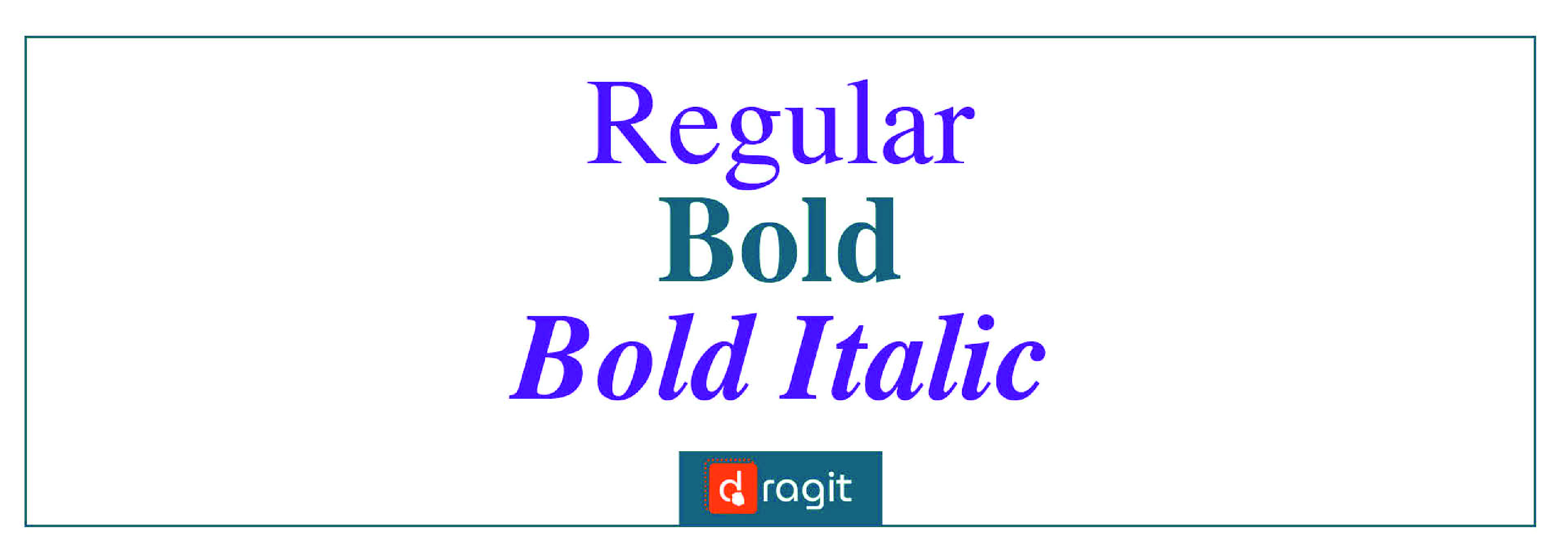
c) Font Weight and Style
Weight is referring to how bold or thin is the font going to be. Style, refers to how the letter look differently in a given font family, the most famous one is italic.
d) Font Family
Font family is a set of fonts, that have similar designs, but that can often vary in weight (light, bold), style (italic), etc. One of the most famous font family is Times New Roman. When considering our email template font, we can focus on these following 5 main family groups:
Main Font Family Groups
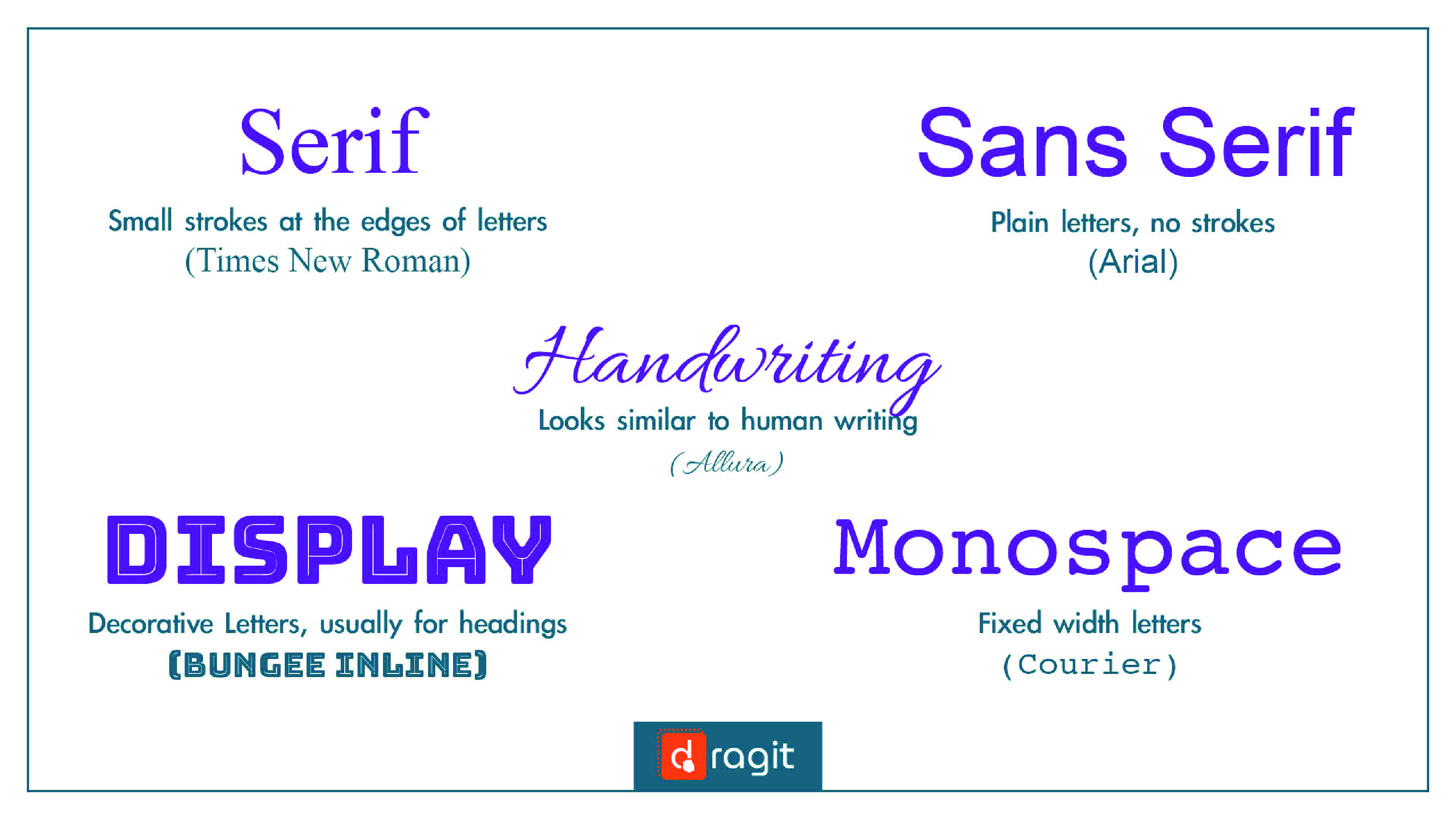
NOTE: Dragit, as well as Google use these main 5 family groups for sorting their fonts.
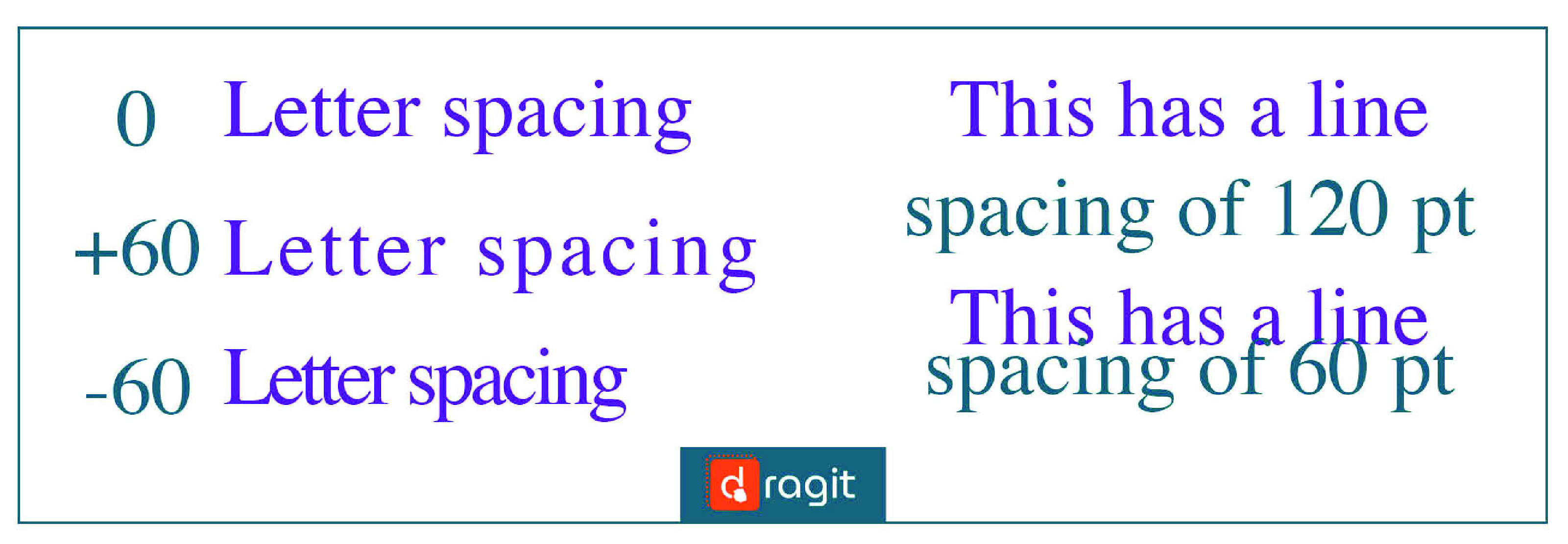
e) Font Spacing and Alignment
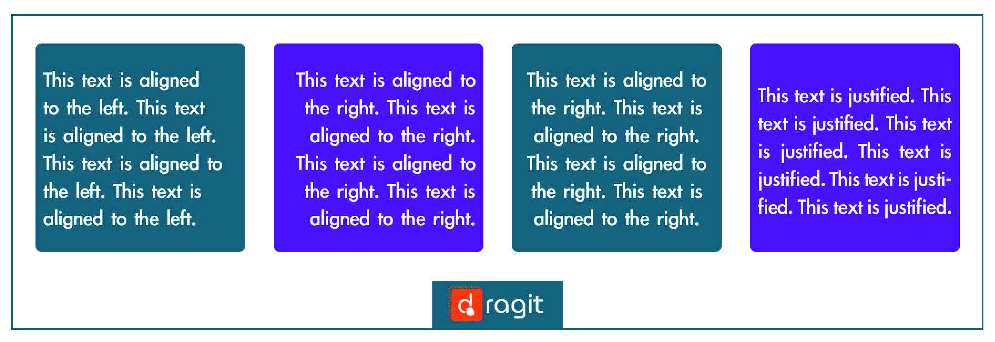
You can usually select line spacing (spacing between the lines of text) and letter spacing (spacing between the letters). Font alignment can be left, right, center or justified (we tell you which one is best later!).
f) Font Locations
You will stumble upon these two types of font locations: System Fonts and Web Fonts. System fonts are located on your operating system, they work as they are supposed to and are a good e-mail font option. Web fonts exist on the web. You can find more specific and creative fonts this way, but as they just float around the infinite sea of web content, there is no certainty that they will show up properly in any given email client. So we recommend you to be careful and research a bit more before using them, to avoid any unwanted surprises!
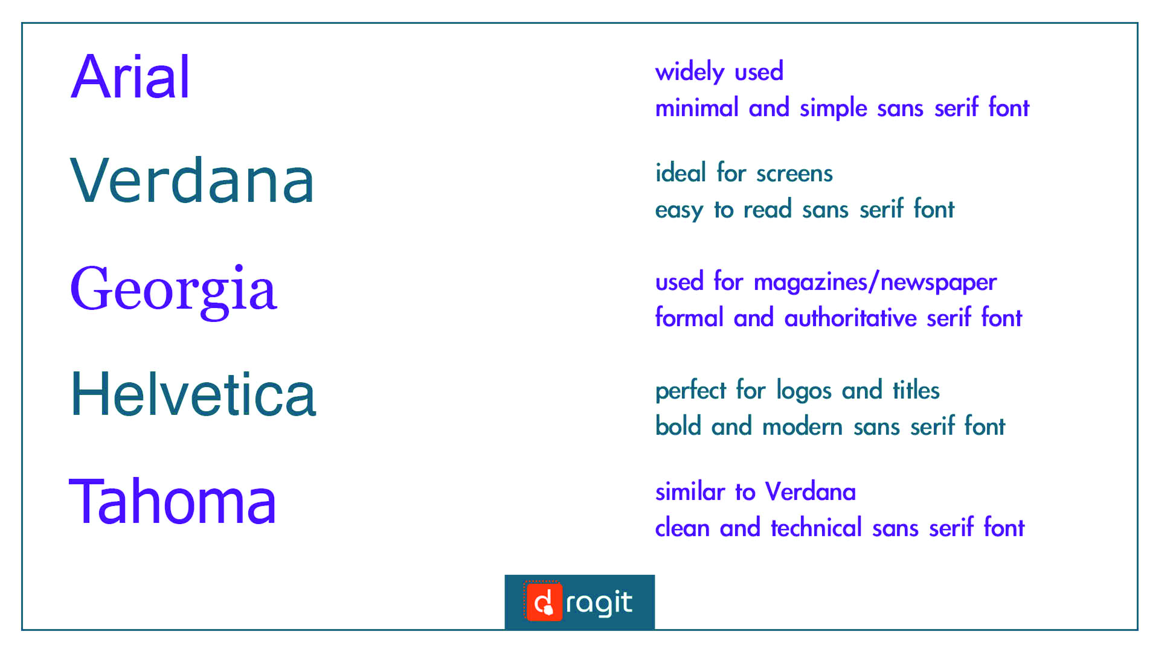
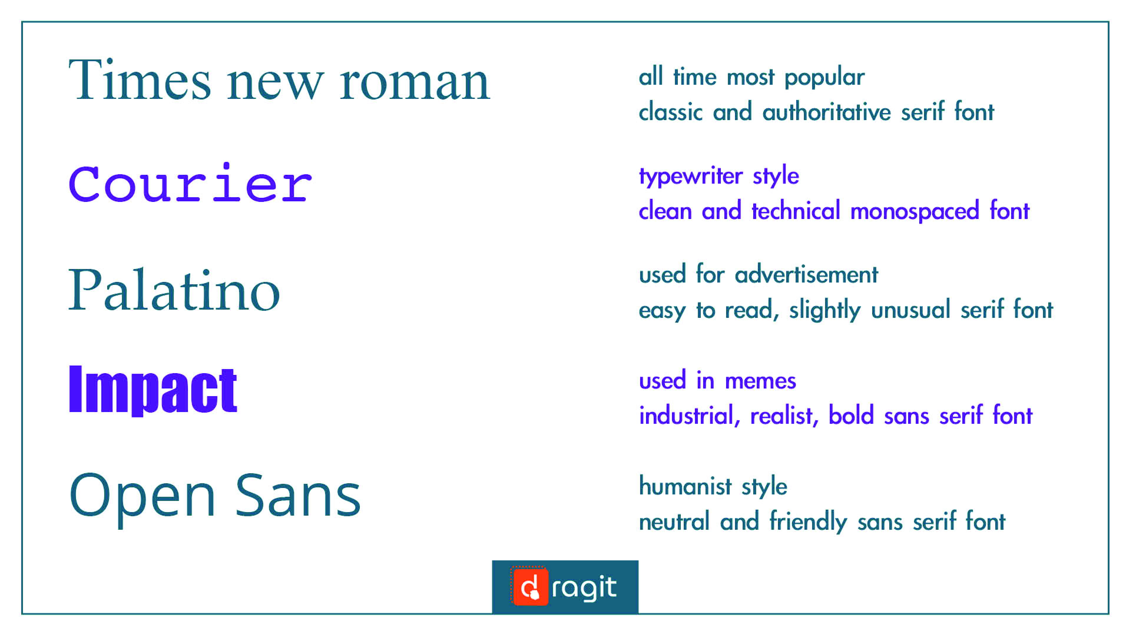
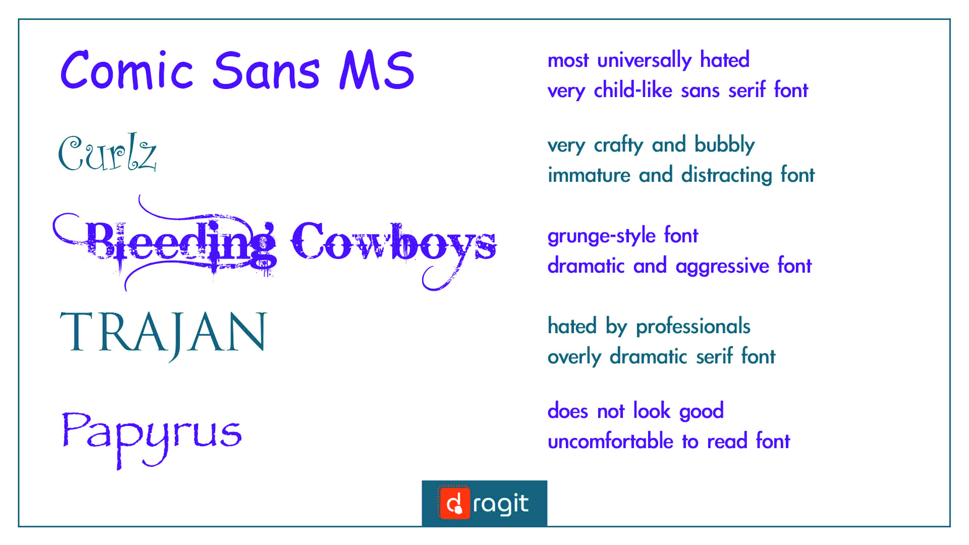
Tip 1. Know the Most (and Least) Preferred Fonts for Email Templates
As we stated earlier, there are thousands of fonts that you can choose. To narrow it down for you to the complete basics, here are some fonts that are best and worst to use, so you have some ideas about what is/is not used and what can be useful/useless to you.
Top 10 Most Preferred Fonts (We Love at Dragit!)
Top 5 Least Preferred Fonts
Tip 2. Know Your Brand and Purpose
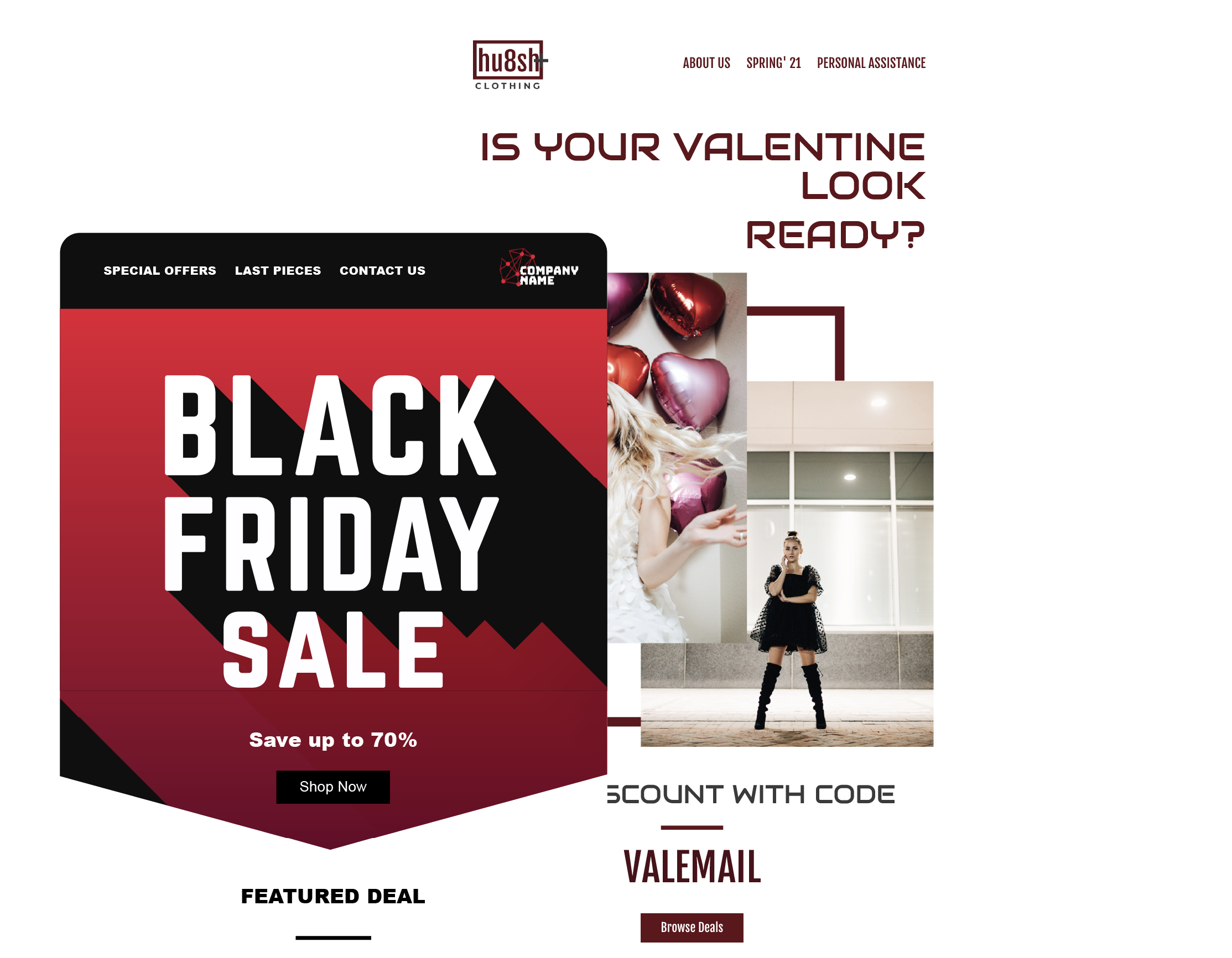
It is crucial to always take branding into consideration when designing email templates. We have spoken about it in our previous articles (if you want to know more read "5 Best Practices of Winning Promo Emails”), it is who you are as a brand, what is your philosophy, your design choices, your language and approach to your employees and costumers. Every step you take in your email template design should reflect your branding and that is also true for the font. Do not clash, but compliment. When you picked your logo and started your brand, you already had some fonts in mind. We recommend you to build on them and use them.
Colours are usually also part of your brand, if you want to know more about colour theory and psychology read our article “How to design the best call-to-action button” (there you can learn it all!). To sum it up, when you are using your fonts, you have to always refer to your brand and its colours. The best idea is to use any web available colour matching tools, that help you to find contrasting, complimentary and other colours that will make your email template pop!
Psychology of fonts is also important. When we mentioned TOP 10 fonts earlier, what we did is, we mentioned some feelings associated with them. You know what you want your brand image to be. We recommend to stick to using fonts that correspond with it. If you want to be sleek and minimal use simple fonts as ARIAL, if you want to show that your brand is very formal and authoritative use fonts such as GEORGIA. Try out everything your learned in our amazing Email Templates.
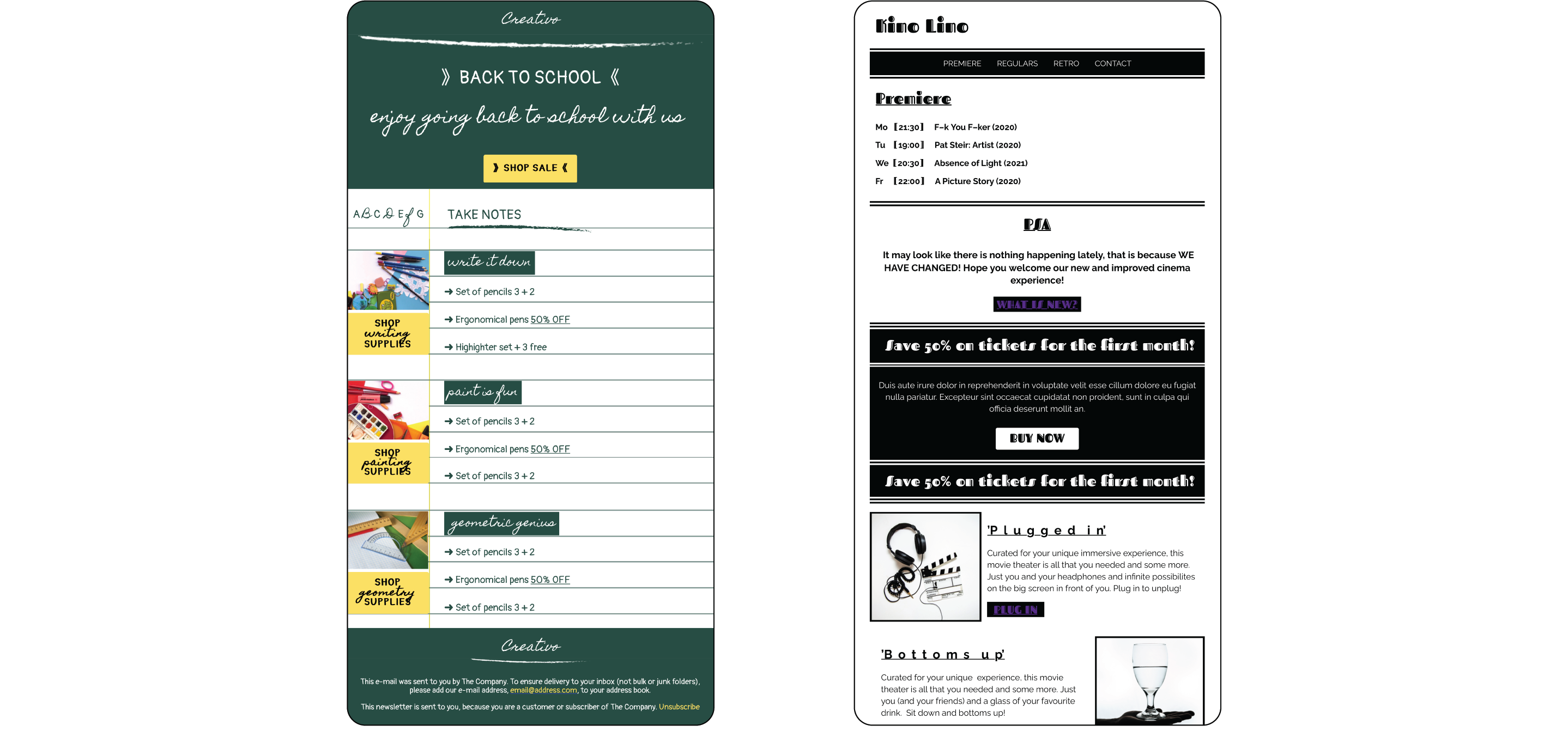
Get This Free Back to School Email Template Here
Get This Free Kino Lino Email Template Here
If you are not sure, and even if you are, testing is the best what you can do for your email marketing no matter what aspect of it you are curious about, same goes for text. If you are starting up with fonts, unsure which font would work the best in your email template, just go on and create two versions with your two top picks and see what happens!
Tip 3. Know Where You Need to Be Bold
CTA Buttons are the best example of knowing where to be bold. We all aspire for our emails to generate traction and the best is in forms of clicks on our CTA buttons. Buttons are there to generate sales and all the other traction we desperately seek. You can learn the best tips and trick in creating CTA buttons in our previous article HERE ! What is the most important for us now, is to make them stand out and especially the text! Seek high contrasts, bold weight and readable font!
Colours help you to be bold but can also have the complete opposite effect. Good idea is not being overly confident in your colour choice before you test it. Sometimes you might assume that the contrast is high enough, but it may not be nearly as good as you think!
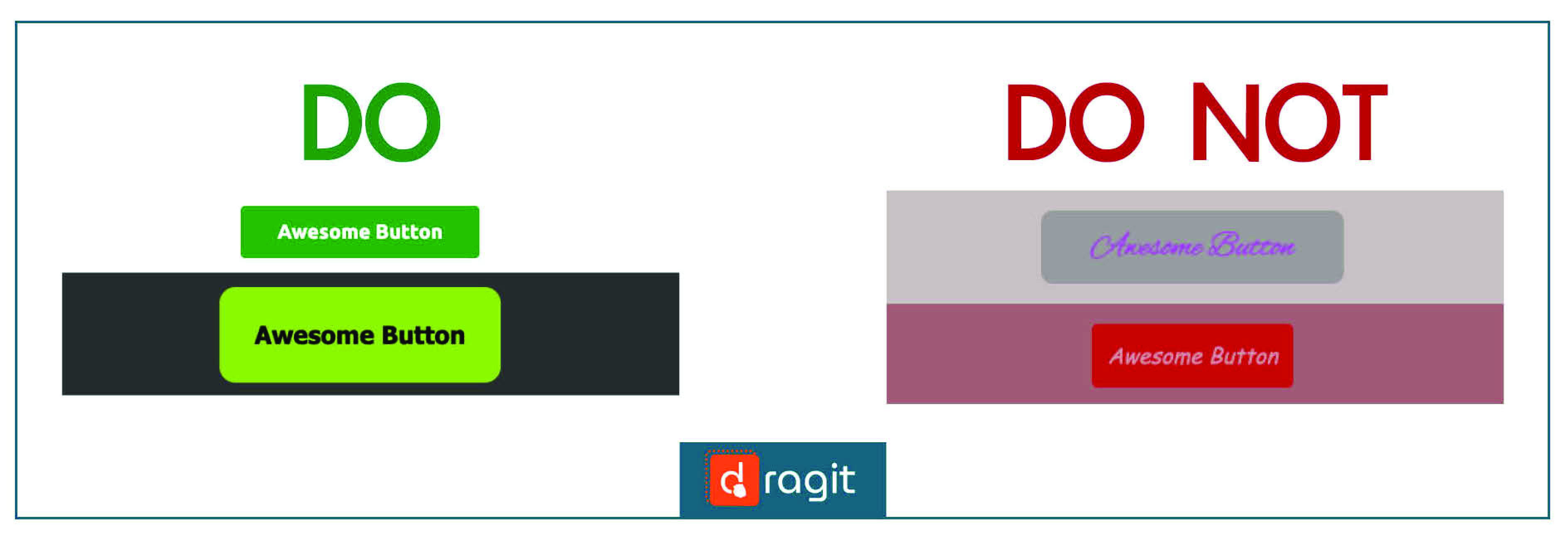
Logo should be one, if not the BOLDEST, font/element you use in your email. You want to be memorable, stick to your branding (as mentioned above), contrasting (so your logo does not blend in with the background) and just BE YOU!
Tip 4. Know How to Pair Fonts
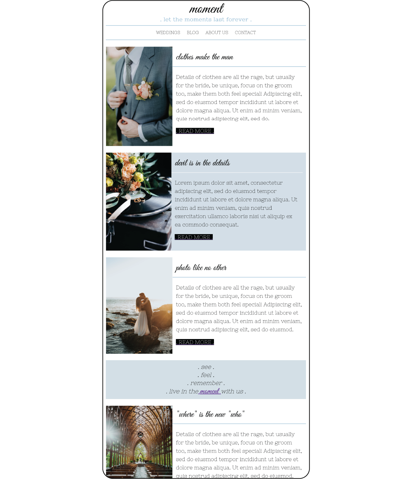
Font families are a sure way to find some related fonts that do work together well. But it is not necessary to go for same or similar fonts, key is to compliment. We can say, that what compliments is more in the niche design/art realm. But you will find tons of tips on online, so you don't have to feel disheartened just because you are unsure what would work together. During designing, everyone uses some sort of guesswork and gut-feeling-check for their font pairings as well. And in case everything else fails, you can always test test test your best guesses with your audience!
Get the best out of the fonts for your email templates with Dragit!
Sign up for free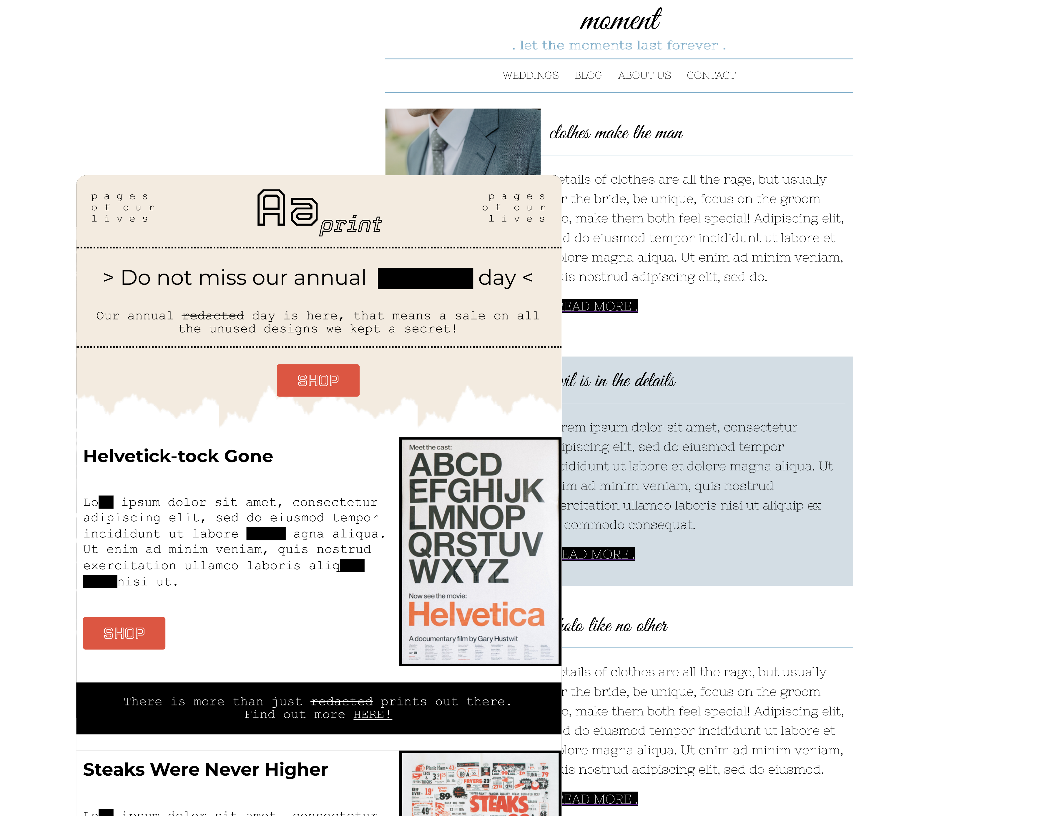
First, it is best to pick the hierarchy: headers, subheads, body, CTA, etc. When you know, what you want to attract people to, pick bolder, bigger, more creative font(s) for those areas. That should be able to draw the eye first to key elements, such as logo, headline or special offer. Then use simpler font(s) for body text.
Second, it is important to think of purpose, as mentioned earlier, you need to know who you are and what you want. How do you want to make your readers feel? Fresh and playful? Use open sans! Bold and industrial? Use Impact!
Third, it is great to be impactful but not to clash! If you don't know where to start to create impact and contrast, it is nice to use one serif and one sans serif font, many of them compliment each other beautifully!
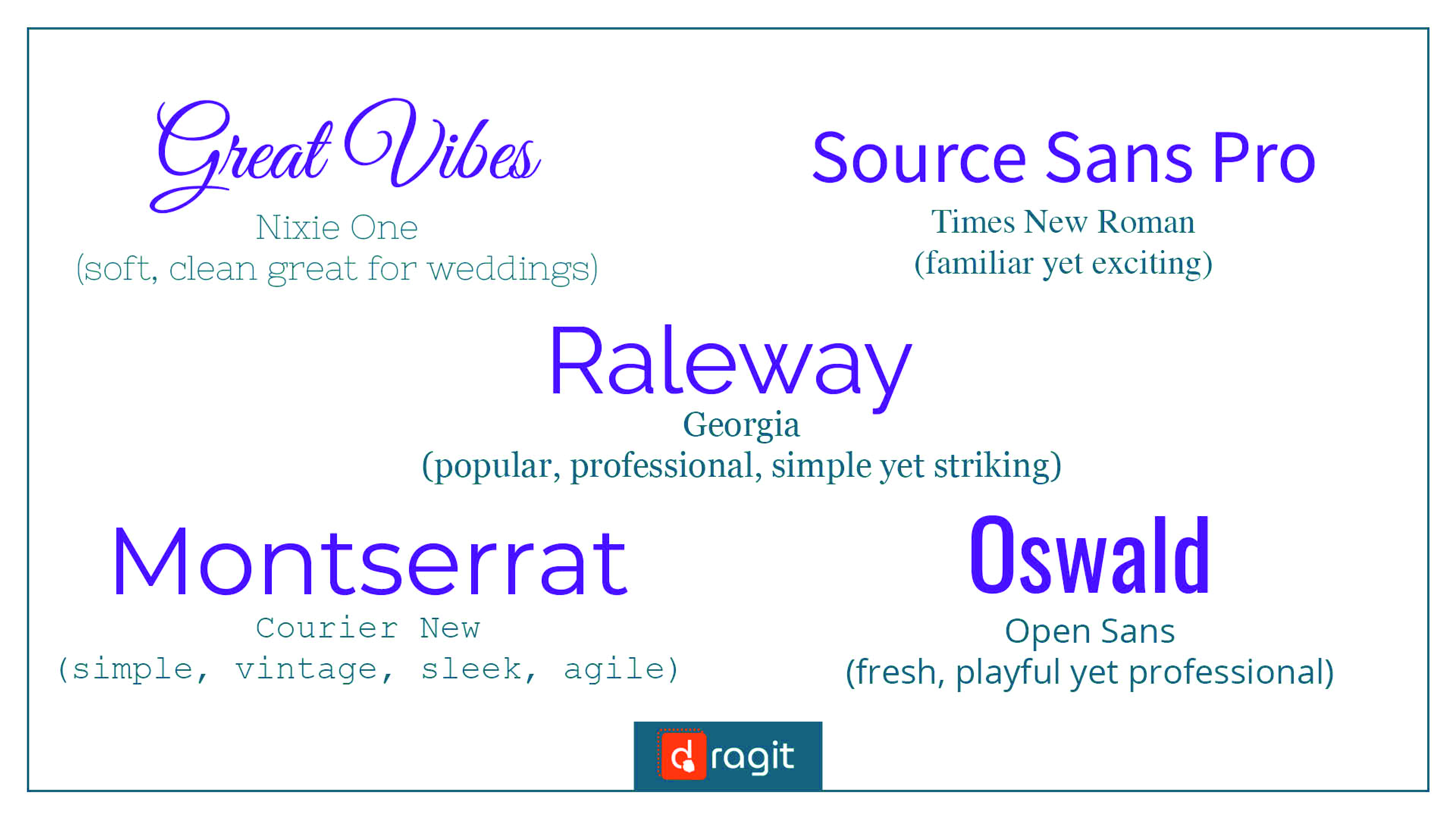
See some nice font pairings here:
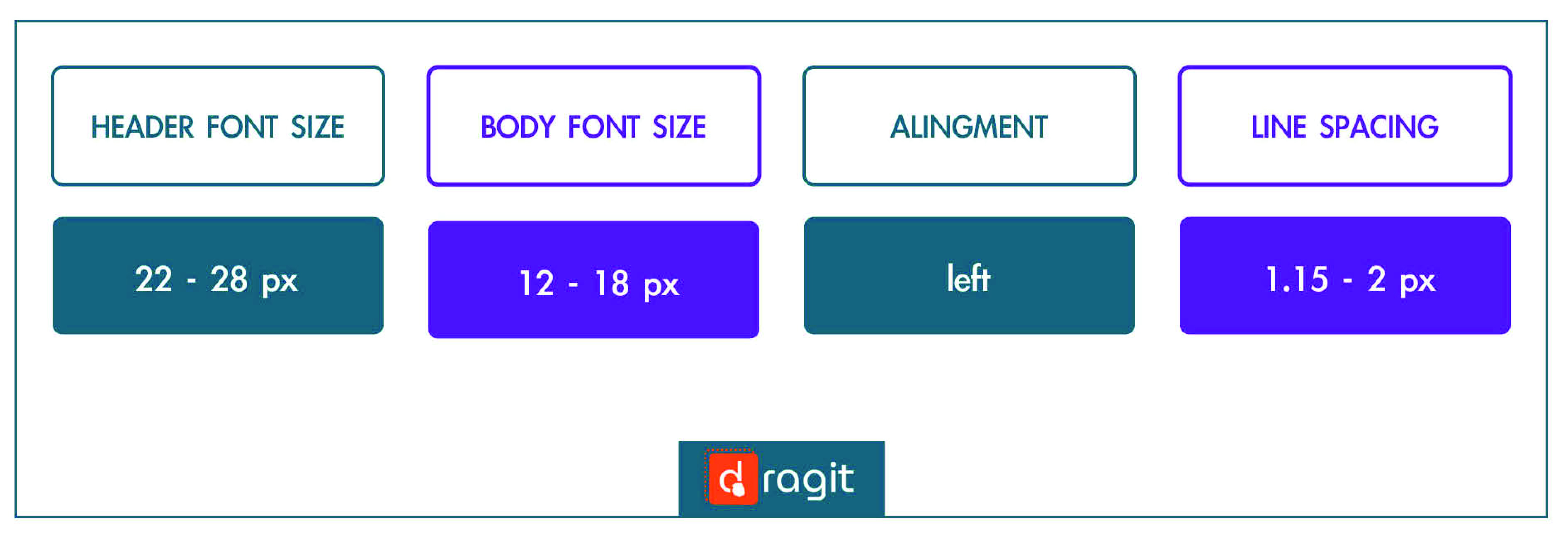
Tip 5. Know How to Be Legible
Be clear and readable! For this you would need to:
- have a good font spacing (1.15 - 2px line spacing)
- keep a proper font size (using 22-28px for headings, 12-18px for body is usually ideal, bigger range is for mobile)
- choose clear and legible font, that helps the readers to read everything as fast as they can and helps you guide them properly throughout your whole email template
- have an eye-catching logo (bold, most creative font on the page, should not be outshined!)
- have outstanding headers (clear font, bolder and bigger than the body)
- have a legible body (clean, regular weight font, sleek, easy to read fast as it is usually the longest text)
- create converting CTAs (bold, colourful, only font that can be literally screaming)!
Now just sell sell sell!!
!TIPS AND TRIKS!:
SUMMARY
Fonts are a very crucial design feature to your email templates, that can make or break them. You now know which ones are best to use to be completely safe and still show a bit of your brand personality, which ones to avoid, how to look for fonts based on their families. You have also learned how find and/or choose some nice font pairings and how do decide which fonts need to stand out the most and most importantly, how to make everything legible yet creative and still YOU!
Don’t lose another minute procrastinating and try it all out now in our Dragit Email Editor!!